How Bad Is Global Inequality, Really?
CAPITALISM, 8 Apr 2019
Jason Hickel – TRANSCEND Media Service

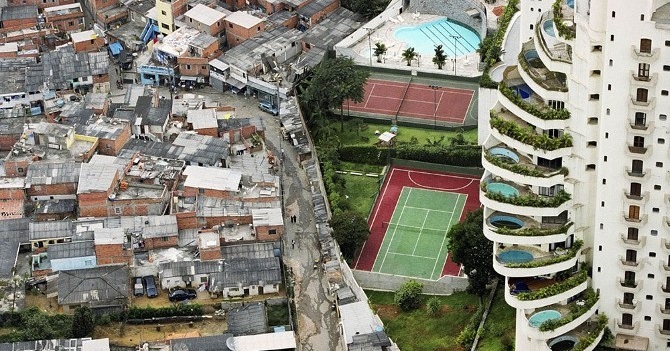
The Paraisópolis favela borders the affluent district of Morumbi in São Paulo, Brazil.
Photo credit: Tuca Vieira.
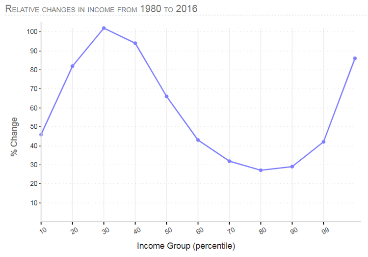
3 Mar 2019 – Most everyone who’s interested in global inequality has come across the famous elephant graph, originally developed by Branko Milanovic and Christoph Lakner using World Bank data (see below). The graph charts the change in income that the world’s population have experienced over time, from the very poorest to the richest 1%.
We can update the elephant graph using the latest data from the World Inequality Database, which covers the whole period from 1980 to 2016 using a method called “distributive national accounts”. Here’s what it looks like in real dollars (MER), developed in collaboration with Huzaifa Zoomkawala:
The elephant graph has been used by some to argue that neoliberal globalization has caused inequality to decline since 1980. After all, it would appear that the biggest gains have gone to the poorest 60% of the world’s population, whose incomes have grown two or three times more than those of the richest 40%.
But this impression can be misleading. It’s important to recognize that the elephant graph shows relative gains, with respect to each group’s baseline in 1980. So the poorest 10-20th percentile gained 82% over this period. That sounds like a lot, on the face of it. But remember that they started from a very low base. For people earning $2.40 per day in 1980, their incomes grew to no more than $4.36 per day… over a period of 36 years. So, about 5 cents per year.
That’s not much to celebrate, particularly when these gains don’t come anywhere close to lifting people out of poverty. Remember, the poorest 60% – the ones depicted as the “winners” in the elephant graph – continue to live under the poverty line of $7.40 per day (2011 PPP).
Meanwhile, the global rich may have seen their incomes increase by a smaller proportion, but because they started from a much higher base their absolute gains have been far greater.
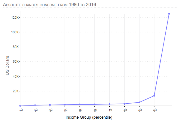
What we need, then, is to render the elephant graph in absolute terms, to see who’s benefited most from the distribution of new income around the world. Here’s what it looks like:
Suddenly the story changes. It becomes clear that it’s the richest 1% who have gained the most – by far. The incomes of the world’s poor have barely budged by comparison.
It’s not an elephant graph anymore. It’s a boomerang. This seems a fitting image, given how income has an uncanny way of circling back to those who already have it. Or we could call it a scythe, which nicely captures how the rich are harvesting the world’s abundance for themselves.
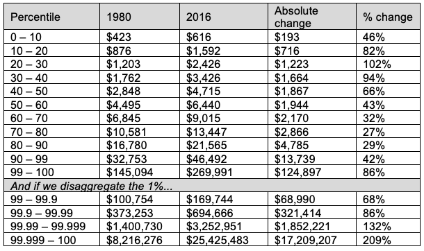
Things get even more extreme once we start separating out top incomes, which is what the World Inequality Database allows us to do. Click here to see how the “elephant” shape disintegrates and the scythe becomes even sharper. Here’s a table showing how each group has fared from 1980 to 2016:
The results are staggering, really. For the poorest 60% of humanity, the average person saw their annual income increase by only about $1,200… over 36 years.
Meanwhile, those in the 70-80th percentile, the “losers” according to the elephant graph, are revealed to have gained more than twice that amount. Those in the 80-90th percentile (also represented as losers in the elephant graph) gained four times more. And the richest 1% got one hundred times more.
As for the top incomes… well, they have grown by what can only be described as an obscene amount, with millionaires doubling or tripling their annual incomes, gaining some 14,000 times more than the average person in the poorest 60% of the world’s population.
All of this makes it clear who the real beneficiaries of globalization have been. And suddenly it seems a bit absurd to be touting as “progress” the pennies that have trickled down to the poorest when the overwhelming majority of new income since 1980 has been captured at the top.
_________________________________________________________
Jason Hickel is an anthropologist at the London School of Economics. He specializes in globalization, finance, democracy, violence, and ritual, and is the author of Democracy as Death: The Moral Order of Anti-Liberal Politics in South Africa and The Divide: A Brief Guide to Global Inequality and its Solutions.
Go to Original – jasonhickel.org
DISCLAIMER: The statements, views and opinions expressed in pieces republished here are solely those of the authors and do not necessarily represent those of TMS. In accordance with title 17 U.S.C. section 107, this material is distributed without profit to those who have expressed a prior interest in receiving the included information for research and educational purposes. TMS has no affiliation whatsoever with the originator of this article nor is TMS endorsed or sponsored by the originator. “GO TO ORIGINAL” links are provided as a convenience to our readers and allow for verification of authenticity. However, as originating pages are often updated by their originating host sites, the versions posted may not match the versions our readers view when clicking the “GO TO ORIGINAL” links. This site contains copyrighted material the use of which has not always been specifically authorized by the copyright owner. We are making such material available in our efforts to advance understanding of environmental, political, human rights, economic, democracy, scientific, and social justice issues, etc. We believe this constitutes a ‘fair use’ of any such copyrighted material as provided for in section 107 of the US Copyright Law. In accordance with Title 17 U.S.C. Section 107, the material on this site is distributed without profit to those who have expressed a prior interest in receiving the included information for research and educational purposes. For more information go to: http://www.law.cornell.edu/uscode/17/107.shtml. If you wish to use copyrighted material from this site for purposes of your own that go beyond ‘fair use’, you must obtain permission from the copyright owner.


